Use Variants to Enforce Component Rules in Figma
A Figma feature that has always rubbed me the wrong way is that pressing “delete” on a layer inside of a component simply hides the layer. Don’t get me wrong, this feature is super useful, especially before variants were on the scene. However, relying on this feature to control component options within your design system is haphazard. Hidden layers have a big drawback, which is that they’re all independent of one another. As components grow in complexity, this becomes an annoying time suck. What’s more, it makes the layers panel look messy! (or maybe I’m just picky?)
Now that variants are a thing, we can build those options more explicitly, making them more obvious to other designers in the process. Let’s take the example of a button with an optional icon to the left of the text:
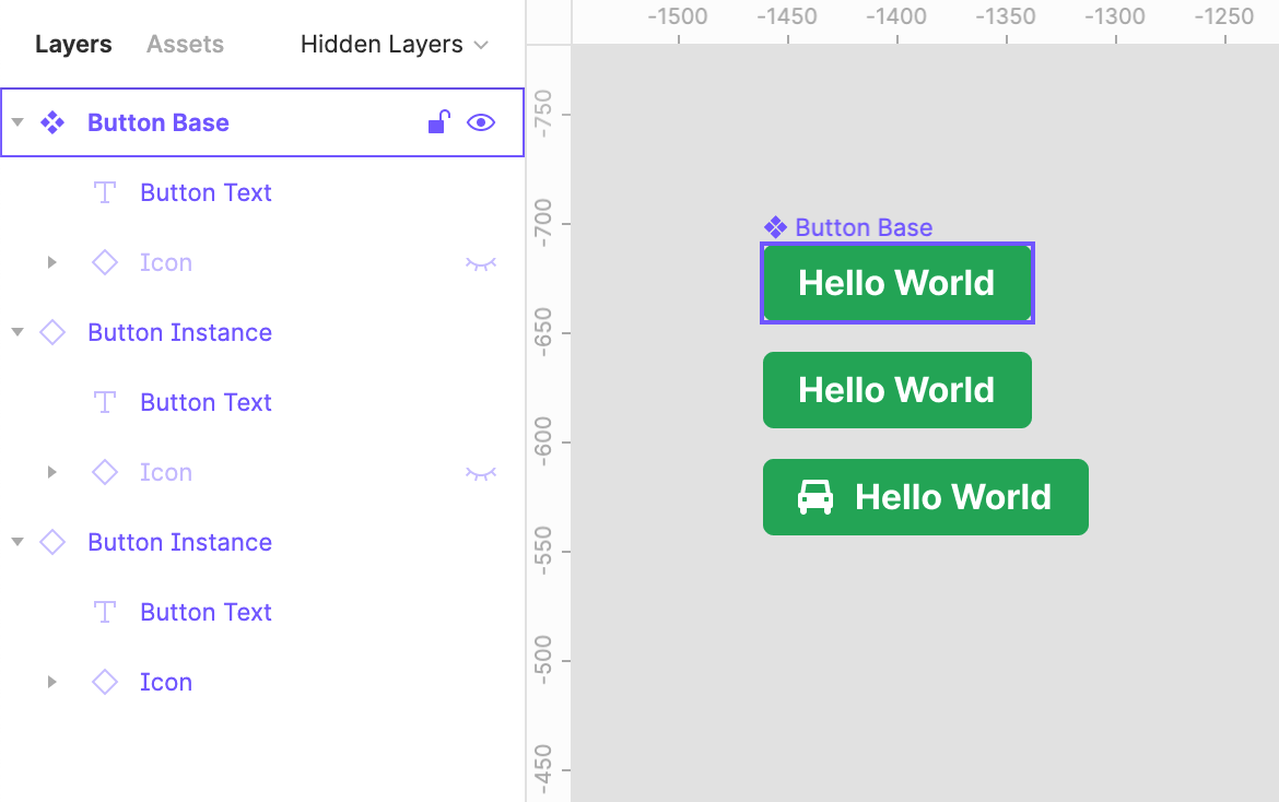
I’ve seen this pattern time and time again: the base component has a “hidden” icon layer which can be made visible for each instance independently, simulating an optional icon. The main downside to this is when other designers are using your component, they’re likely going to be more concerned with the “variants” panel, where component options like this are more formally described:
Depending on the designer, they may be less likely to notice the hidden “icon” layer in the component they’ve duplicated. They might even suspect it’s a vestigial layer that was never removed from the base component and ignore it altogether.
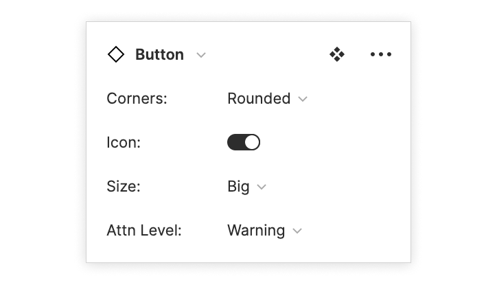
With variants, we can create a boolean “icon” option for the button (like in the
image above) by creating a new property, and setting the options to “true” and
“false”. Figma will automatically recognize properties with true/false or
on/off options and use a switch widget in the variant panel.
A secondary bonus of using variants for optional layers in your components is that it will keep your layer panel tidier. No more hidden “icon” layer in every single instance of your button!
A special thing about variants is that we now have more control over which options can be combined. For instance, we may want our button to have an option for the icon to be on the left or the right of the text. If we’re using hidden layers, we can create a hidden layer on each side of the text and hide both. However, this doesn’t keep someone from using both icons at the same time, which goes against the rules I’ve just now established for our imaginary design system.
With variants, we have more control. We create one property each for Left icon
and Right icon, but we don’t create a variant which describes both of these
properties being “true” at the same time. Figma will pick up on this and enforce
the rule for us:
If you’re designing a component with lots of properties that interact with each other, this is a much better way of ensuring your design system is used correctly without needing to rely solely on documentation. What a boon!